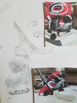
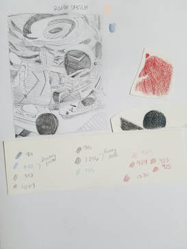
Planning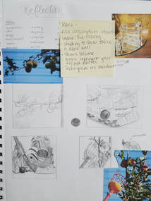 So, I have taken Art 4 before, so most of the projects in the class I will be doing again. The reflections project would definitely be one of those I am doing again. My project last year was reflecting the biggest part of me : jump rope. Since that had a bigger personality reflection I wanted this years to be a more reflective composition physically. I started off by looking at some of my unused ideas from last year, good thing I didn't do any of them because they kinda sucked. After just listing some items I thought reflected me I came up with 10 ideas (sorry I covered them up with critique notes). I managed to narrow it down 2 ideas. My family goes apple picking every year, and I feel like its a big part of my life, so I tried to draw different compositions of that. After borrowing my friends hockey gear to take the other picture I knew I was going to like this composition more. I love hockey, my friend that I borrowed the hockey gear from has played hockey for as long as I have known him. I grew up playing hockey with him and watching hockey games. Hockey one of the very few sports that I can tolerate watching and actually enjoy watching. After I did my first 4 compositional sketches I did a few more detailed drawings of the hockey gear to see what I liked and to plan my colors.
ProcessFinal Thoughts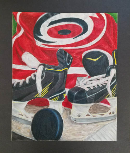 Even though I planned on doing a more physical reflective piece, I ended up doing more of a personality reflective piece. When I look back over my projects with prismacolors each one gets a bit better. I love how this project turned out. I think the successes of the piece are the hockey puck and the fabric. I had a lot of black in the the objects in the composition and I didn't want to use the black pencil. I am really proud of the hockey puck, not once did I use the black pencil in there. I did use a bit of black in the skates though. I have never done fabric before, let alone trying to draw fabric in color. I decided to do a rather thin layer of color blocking first so I could see the lights and the darks. Then I would go back and forth using the medium color and going back over with that light or dark color. Even when you look at the original picture, you don't see a lot of different shades of red in the jersey. I really love the fabric, and since I had never done fabric before I was very surprised on how it turned out. As for the not as successful part of my piece, it would be the carpet. I thought about doing wood instead, but I thought that would be just as hard to draw. I tried to keep the carpet lines as freeform and blurry as possible to make it look more fluffy. The more I tried to add to the carpet, the worse I thought it look. Carpet is hard. If there was something I would change about the piece it would be for sure the carpet.
0 Comments
|
AuthorWrite something about yourself. No need to be fancy, just an overview. Archives
January 2018
Categories |
 RSS Feed
